Forma Atelier
Creative Studio Framer Template
Free
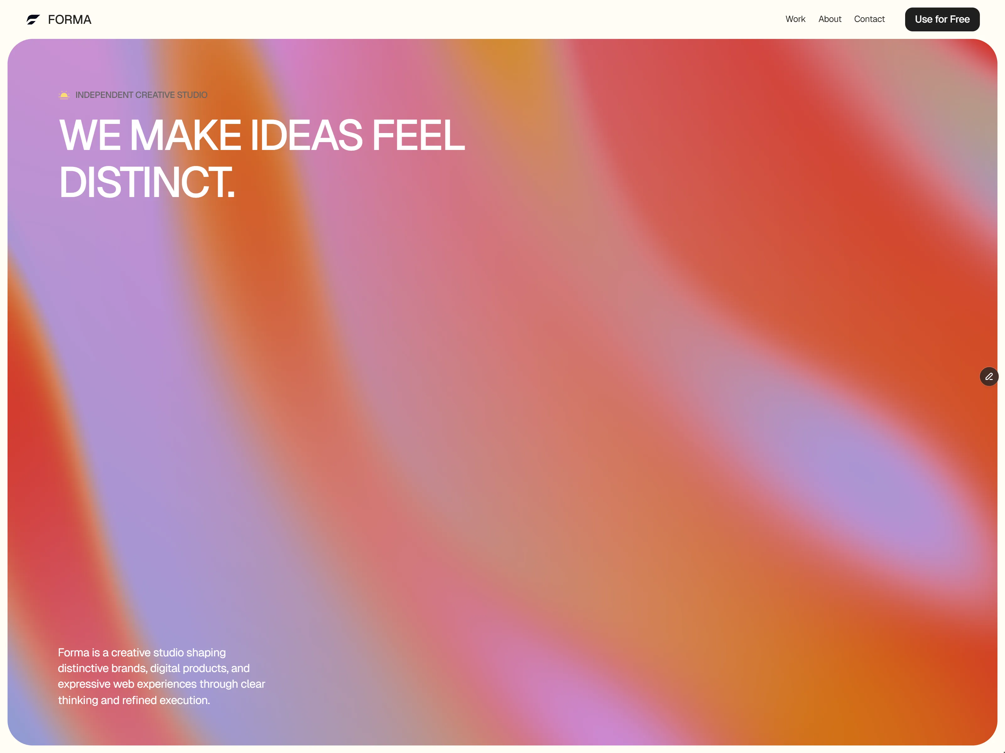
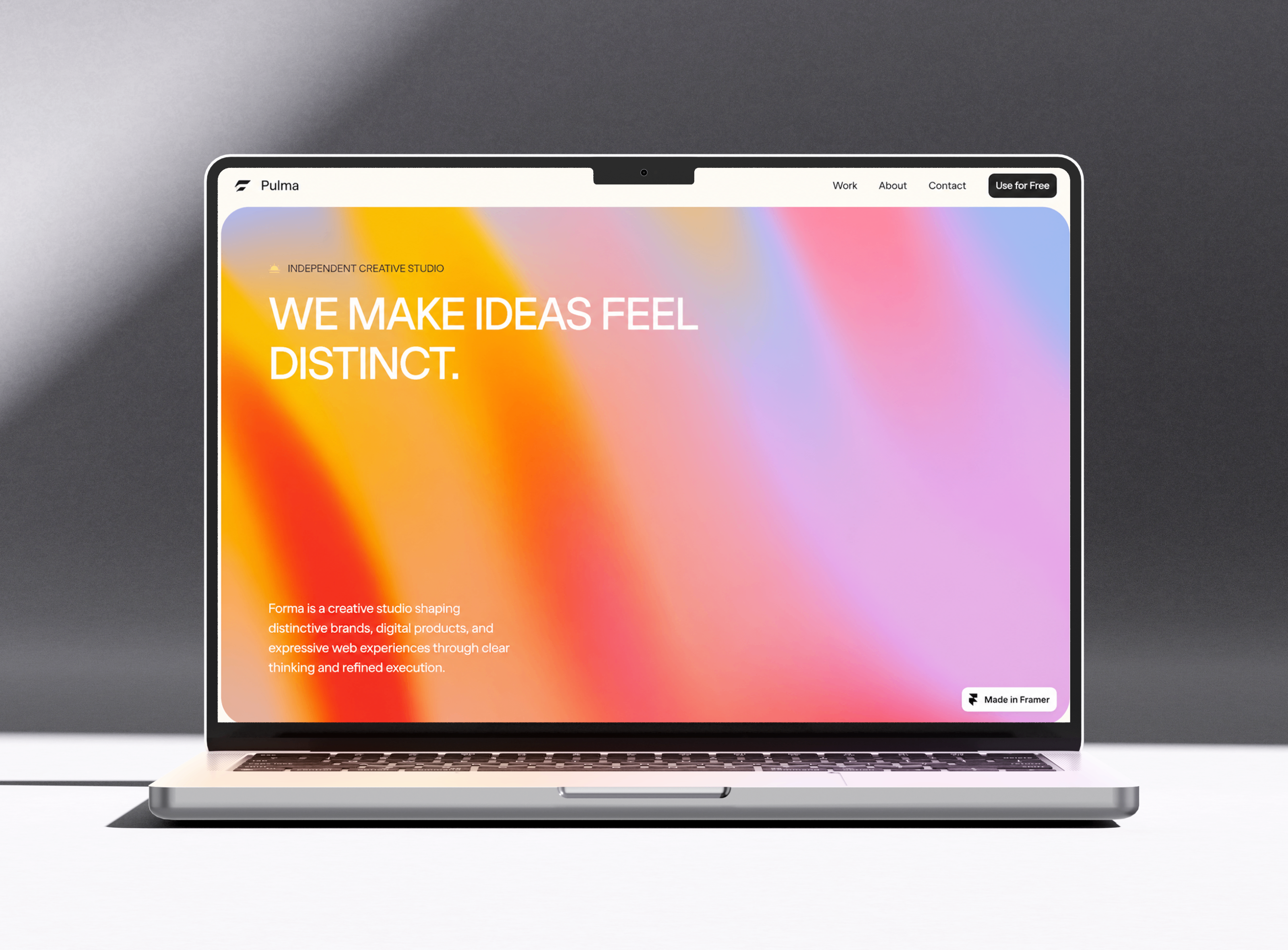
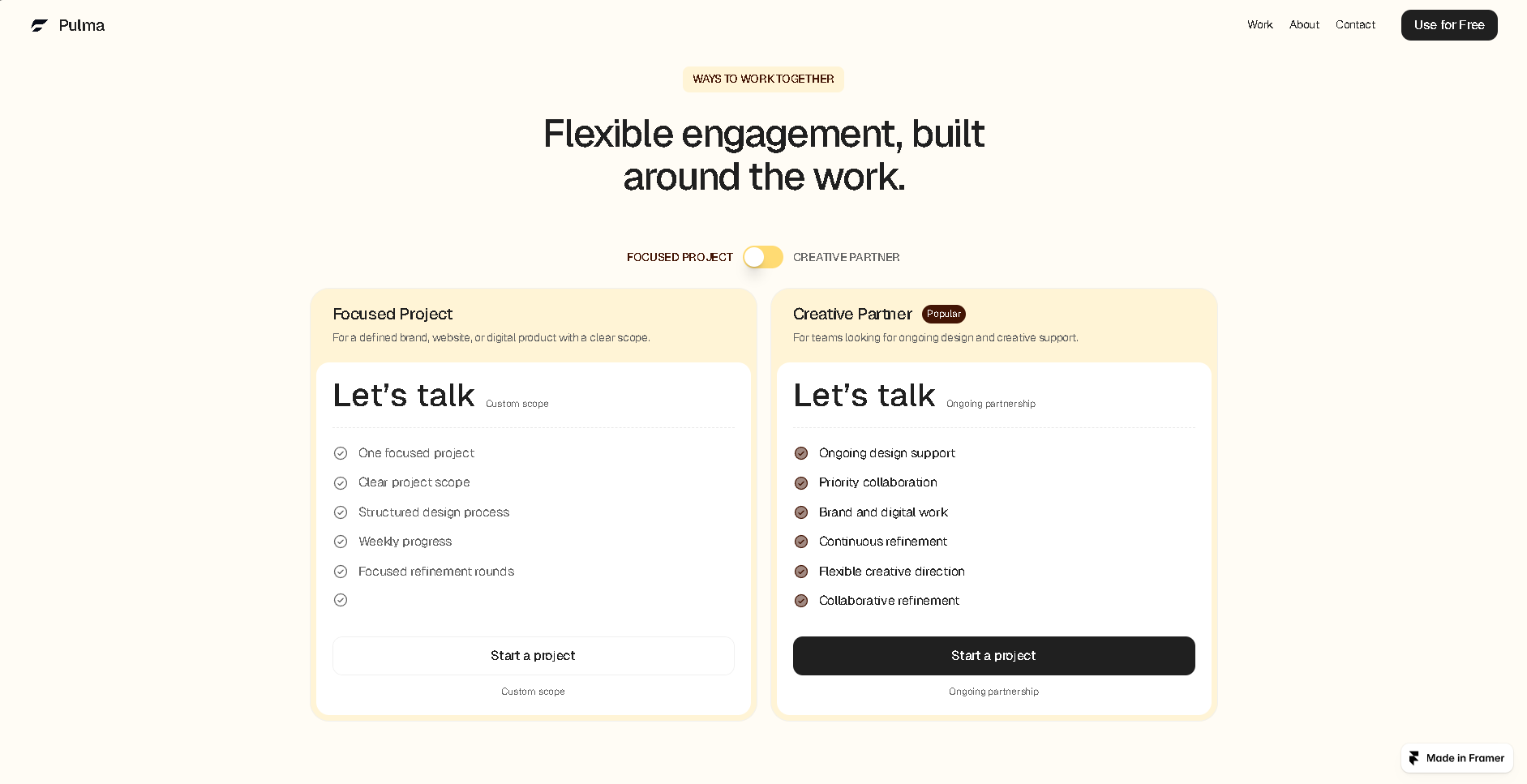
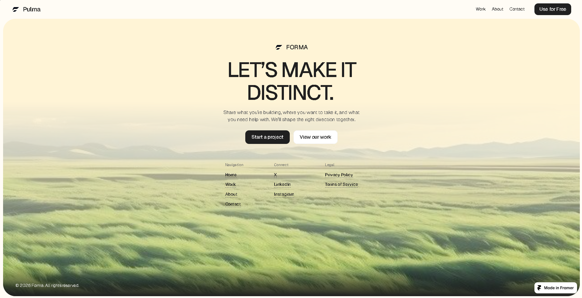
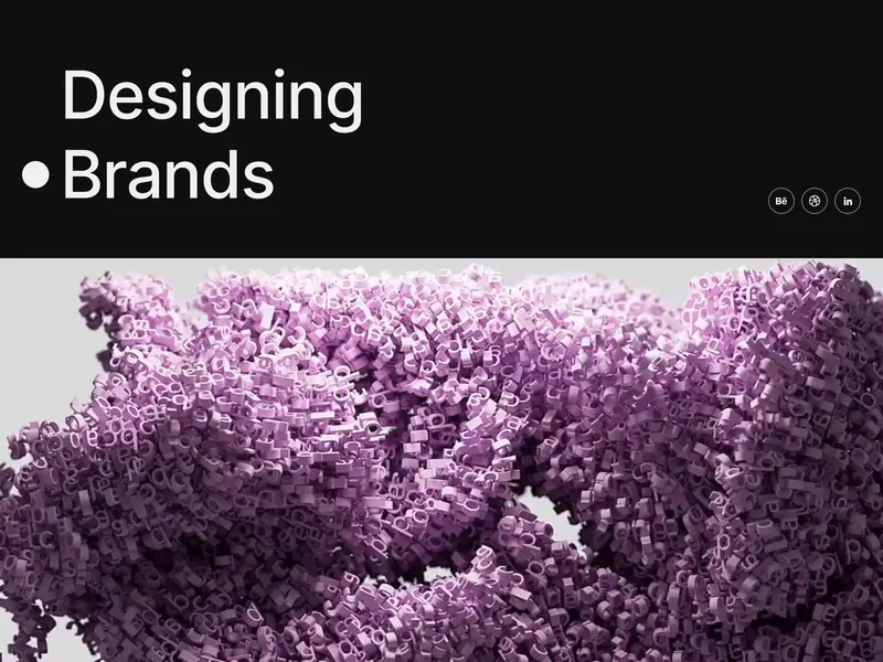
Forma is a premium Framer template designed for creative studios, design agencies, and multidisciplinary teams seeking a polished, editorial-style website. It features a bold hero, immersive project showcases, service highlights, a defined five-step process, and flexible content areas.
About this template
Forma is a premium Framer template created for independent creative studios, design agencies, branding teams, digital product designers, creative developers, and multidisciplinary teams who want a distinctive and professional online presence.
Built around a refined editorial aesthetic, Forma combines bold typography, generous spacing, expressive visuals, immersive project presentation, and a clear content structure. The result is a modern studio website that feels creative and polished while keeping the experience simple, intentional, and easy to navigate.
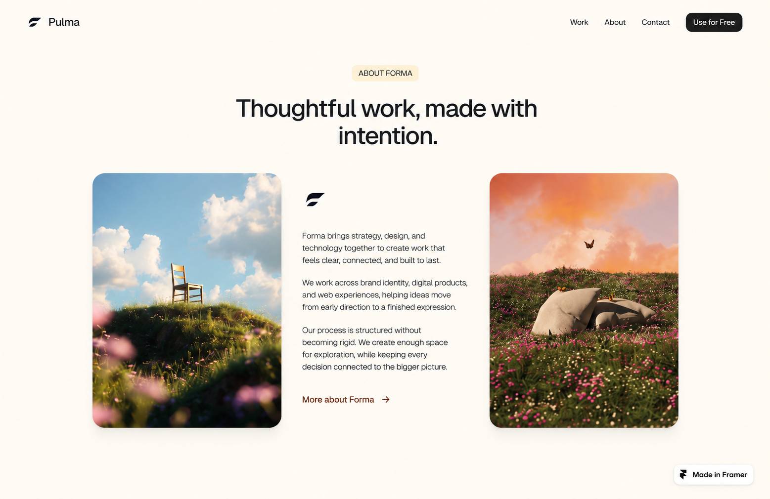
The homepage is designed to make a strong first impression with a statement-driven hero section, followed by About, Selected Work, Services, Process, creative principles, engagement options, FAQ, and a final call to action. Each section has a clear purpose, helping visitors understand the studio, explore its capabilities, discover previous work, and move naturally toward starting a project.
The Selected Work section is designed to showcase distinctive projects across branding, web design, digital products, creative direction, and visual experiences. Dedicated project pages provide space for detailed case studies, project descriptions, visuals, and supporting content, making Forma suitable for both personal portfolios and professional agency presentations.
Forma includes dedicated Work, Studio/About, and Contact pages, with flexible content areas that can be adapted to different creative disciplines. The Services section highlights Framer Development, Product Design, Brand Identity, and Web Design, while the Process section presents a clear five-step workflow: Discover, Define, Design, Build, and Refine.
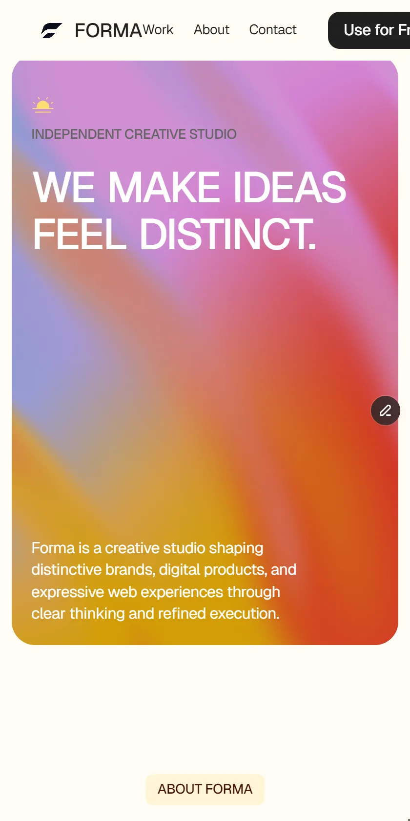
The template is fully responsive and designed to maintain a strong visual hierarchy across desktop, tablet, and mobile devices. Navigation, typography, buttons, layouts, cards, imagery, spacing, and interactions are structured to create a consistent experience throughout the website.
More from Adel_Merabet
View all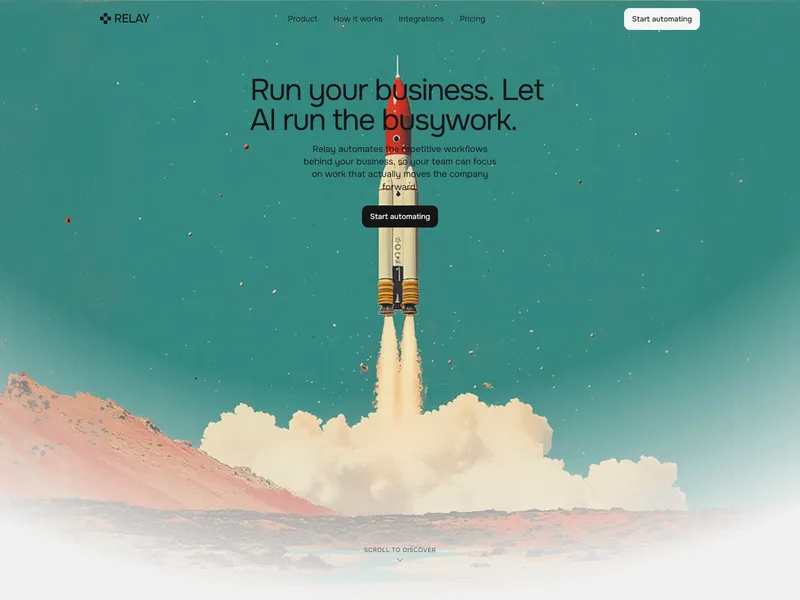
Relay — Workflow
Relay is a premium Framer template for AI and SaaS startups to launch conversion-focused landing pages, featuring clear product narratives, workflow showcases, integration sections, pricing, and CTAs. Designed for AI, automation, and B2B software companies.
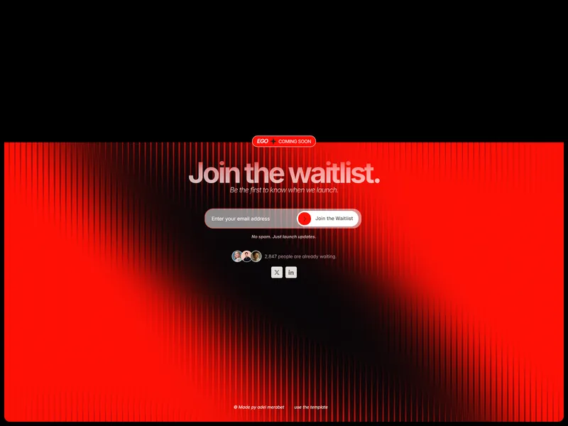
EGO — Waitlist
A modern one-page Framer template for startups and app creators to build anticipation and collect early supporters via an interactive waitlist form, featuring social proof, social media links, and polished interaction states.
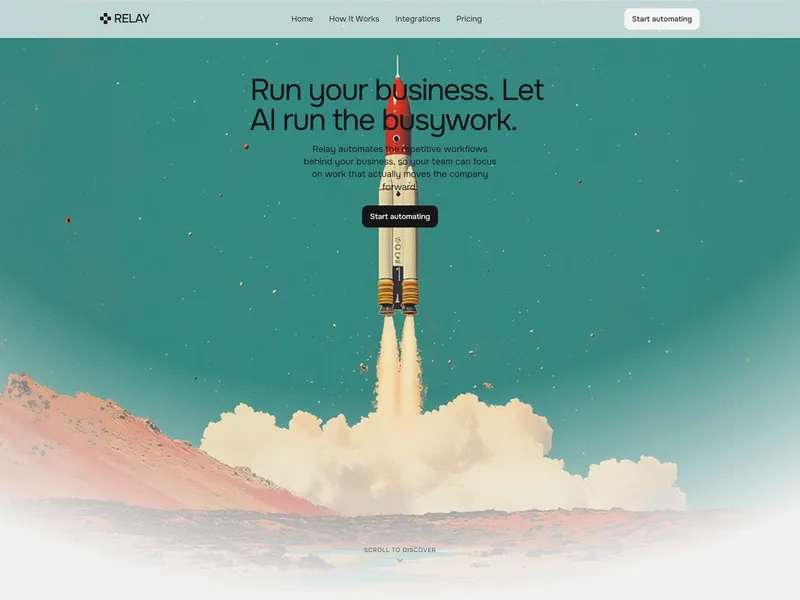
Relay — Launch Kit
Relay is a premium Framer template offering a full AI SaaS website system, including homepage, pricing, integrations, and more. Built for AI startups and SaaS companies, it delivers responsive layouts and conversion-focused components for easy brand customization.
More Agency Templates
View all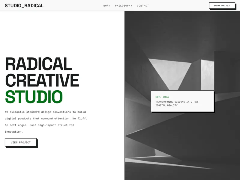
STUDIO RADICAL
RADICAL is a premium Framer template designed for creative studios, independent designers, and digital architects seeking a bold, high-contrast neo-brutalist portfolio or agency site foundation with structural, ultra-clean layouts.
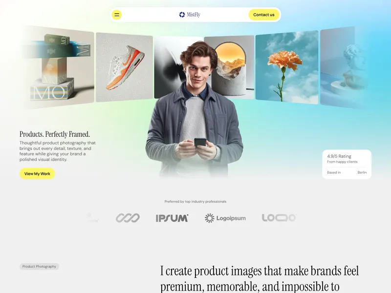
MistFly
MistFly is a clean, image-focused Framer template for product, commercial, and creative photographers. It features an image-led portfolio, service details, testimonials, workflow steps, pricing packages, FAQs, and multiple CTAs to guide clients through the booking process.
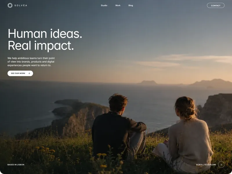
Solvéa Studio
null
More Portfolio Templates
View all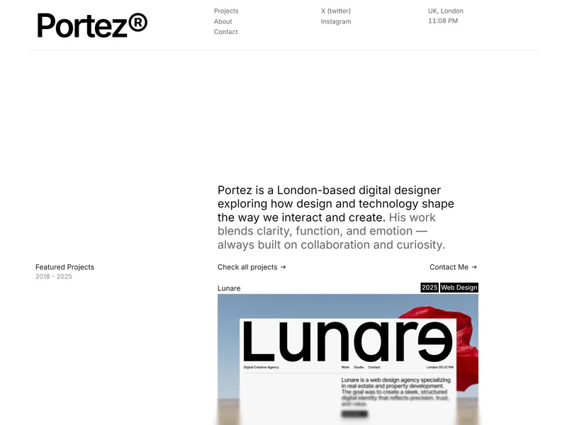
Portez
Portez is a professional portfolio website template for designers, agencies, and studios. Built in Framer, it’s designed to help you present projects, case studies, and visual work with a clean layout, strong structure, and fast performance.
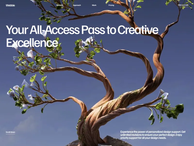
Webbie
Discover a world of possibilities with Webbie's subscription model website agency. Our tailored solutions empower businesses of all sizes to thrive in the digital age.
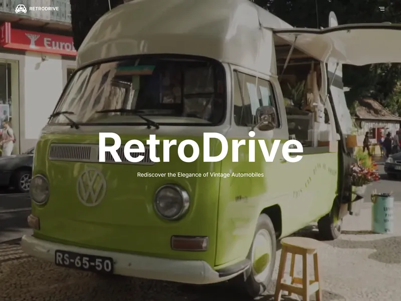
RetroDrive Classic
null
More Services Templates
View all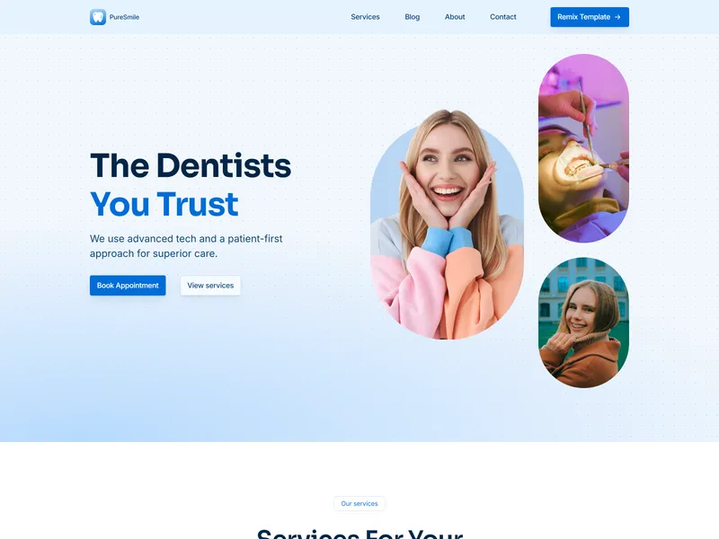
PureSmile
PureSmile is a responsive and modern template created for dental clinics. With customizable features and sleek design, it’s the ideal choice for showcasing services, attracting patients, and building a professional online presence for your clinic.
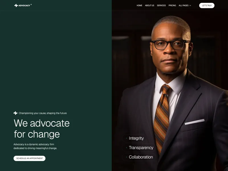
Advocacy
Advocacy is a modern Framer template built for advocacy websites, lawyer, law firm, and attorney. Perfect for any advocacy group, law firm, or attorney aiming to promote justice, legal services, and professional lawyer representation.
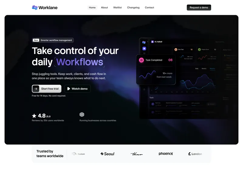
Worklane
A modern SaaS template built for workflow management and productivity tools. Designed to adapt to any software product - business platforms, automation software, scalable SaaS solutions, productivity software. From early-stage startups to scalable softwares.
More Creative Templates
View all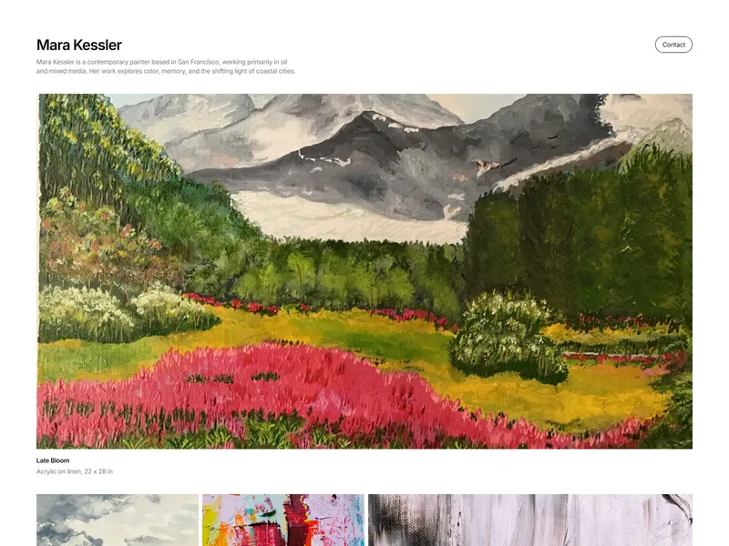
TheArtist
A clean, minimal portfolio template for artists, photographers, designers, and other creatives seeking a distraction-free showcase. Features a responsive image mosaic with full-width hero, grid layouts, and lightbox previews, powered by intuitive CMS editing.
Solvéa Studio
null

Elements
Effortlessly build a fully functional, responsive, no-code website for AI-driven products in minutes.
More Modern Templates
View all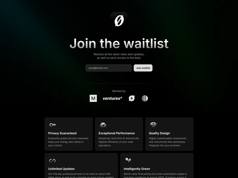
Tromsø
Tromsø is a stunning, professional template that’s perfect for your startup waitlist or countdown page. Featuring customisable components and sections, all crafted with world-class UI and accessibility practices to make your content shine.
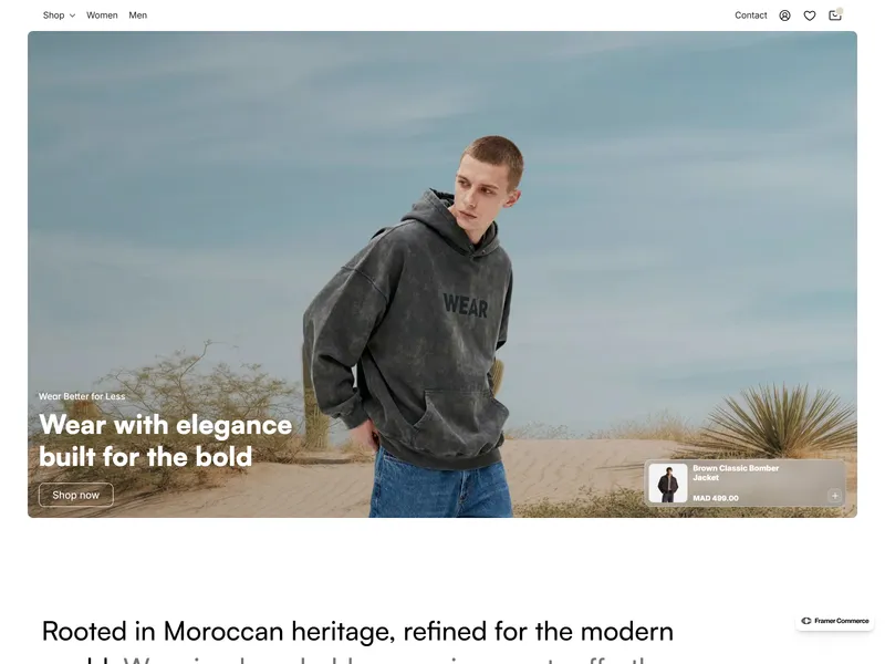
Wear
Wear is a premium, minimalist eCommerce experience built for top-tier fashion and modern luxury brands.
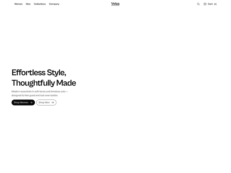
Velaa
Velaa is a fashion-focused Framer template for clothing and lifestyle brands. Featuring pastel aesthetics, responsive layouts, CMS collections, and smooth shopping flows—perfect for launching an elegant, modern online store effortlessly.
More Showcase Templates
View all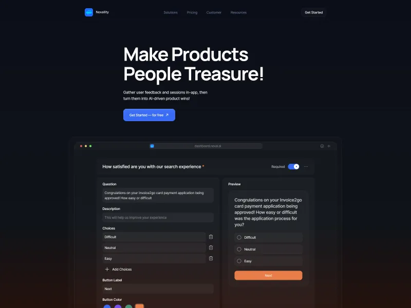
Nexaility
Nexaility is 100% made with Framer. This way all the UI elements you see are customizable. Even graphics and lines! That's why everything looks so smooth and sharp. Nexaility's all-in-one template elevates your startup!
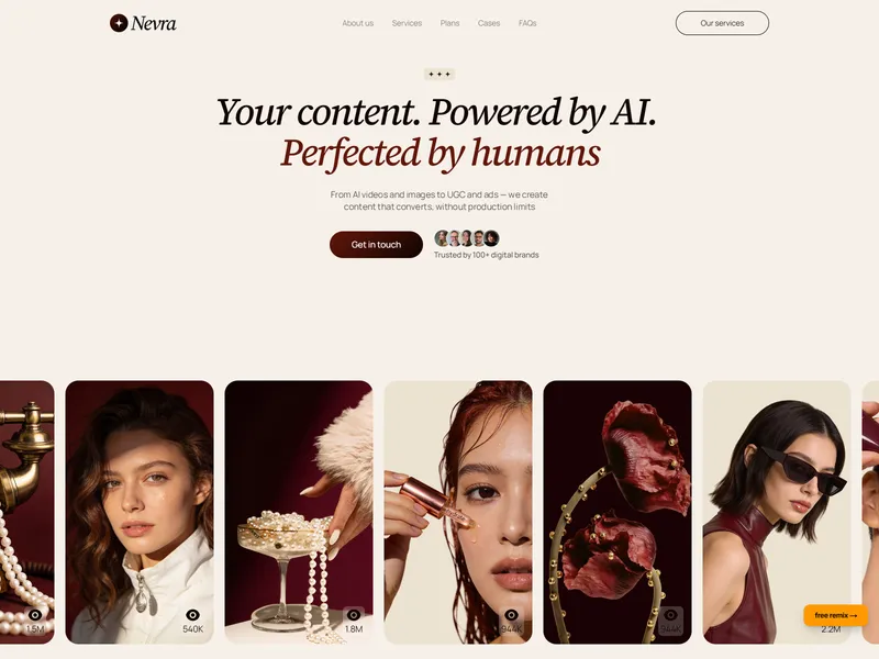
Nevra
Free Framer template for AI content and UGC agencies. Elegant editorial design, smooth animations, and landing page built for TikTok, Instagram, and social ads.
Oscar
Elevate your online presence with Oscar, a modern portfolio template designed for designers and agencies. With sleek animations, custom cursors, and descriptive project pages, it's perfect for showcasing your work.